vividreal | June 23, 2020
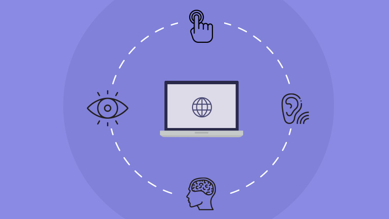
10 Ways to Make Your Site More Accessible
Accessibility is one aspect of website growth that determines the limits to which a person could consume your website content. It even has the capability to keep a section of potential website users away from the website.
People would leave your website if they don’t find it convenient to use. As a website owner, you wouldn’t be interested in losing your potential website visitor. You need to find ways to consider and accommodate the interests of people with diverse preferences, traits, and disabilities. The websites built addressing common users’ concerns attract every possible prospect of your brand/business without missing out on any of them.
We can help you if you’re dealing with accessibility issues for your website. We have a dedicated team of developers to fix such issues. Feel free to connect our web development team if you require any kind of assistance.
In this article, we’ll be discussing 10 ways to make your website more accessible. Read on to find them out.
1. Use Heading Tags & Structure Content Correctly
One best way to make your website accessible to the users is to structure the website content by using the heading tags (<h1>, <h2>, etc.) appropriately. Structuring the content using heading tags will make your content much easier to comprehend since it’s well-organized. This allows breaking up a long web page into logical subsections with headings. It allows users to jump to the sections they’re interested in with ease.
Most of the time, inappropriate use of heading tags confuse your website screen readers. Instead of picking up a header that looks good visually, adhere to the correct order of headings, and create a separate CSS class to style your text.
You can set the <h1> tag for the main heading on a page. And, use other tags for indicating subheadings. Meanwhile, remember to use only a single <h1> tag on the webpage. Also, avoid using a <h1> for anything other than the title of the website and the title of individual pages.
2. Alt Text for Images
The purpose of alt text is to describe what the image is about. It also acts as the “alternative text” for an image if it fails to load. At times the website users read the alt text to understand the picture more.
Using alt text is important for informative images like infographics, it helps users understand what the image stands for from a single line of text. But, while placing an image solely for the purpose of decoration inside your website, you can leave the alt text empty.
It can aid people using screen readers and speech input software, or people browsing speech-enabled websites.
Not just that, using alt text is an advantage in the SEO perspective as well. Since Google crawlers can’t read images, the relevance of that particular image on your website will go unnoticed. You can turn this valuable resource to be noticed by the crawlers using alt text for them. Since crawlers read alt text, you can use it to convey the meaning of the image as well as include keywords in them wherever it makes sense. This eventually helps in the website ranking process.
3. Colours
To develop a website accessible to all, you need to consider the challenges your website viewers could possibly face. There could be partially colour blind people trying to view your website.
Colours should be used in such a way that website visitors find it easy to distinguish between various elements on the page. Create them in such a way that the text stands out against the background. Also, the colour combinations used should be in such a way that people with learning disabilities understand.
To ensure these, use other visual indicators, such as an asterisk or question mark; you can use any form of visual separator (whitespace or borders) in between to distinguish blocks of content from one another. Use the tools available online to find and test colour combinations instead of experimenting with odd colours.
4. Properly Designed Forms for Accessibility
You must have encountered ambiguity at least once when you were filling forms online. These could happen when the fields are not labelled appropriately, or when uncertainty exists in peoples’ minds about the type of content that should be entered into a form field.
These occurrences seriously affect the site’s accessibility and may even lead to the user bouncing back from your site without completing the task they came for.
To bring in more clarity to your forms, include a well-positioned & descriptive label for each field in your form. Use the <label> tag and associate the label text with the form field. And carefully place the labels adjacent to the respective fields.
The tab order is important while designing the website content. It should be organized to form a visual order. This is important to ensure that a person can go through all tabs in the form and fill out all the fields before getting to the “Submit” button. Otherwise, they would be struggling to submit the form without realizing that additional fields that existed.
You can improve the forms by categorizing the information and help users keep track of progress. For example, group fields like “Full Name” and “Date of Birth” under “Personal Information”. If your website runs on WordPress, use plugins like Caldera Forms.
5. Tables for Tabular Data
Strictly stick to using tables only while dealing with displaying data. Do not use tables for displaying layouts, lists, or anything else. This is because tables distract users from the actual content. It is much easier for all users, including those using assistive technology, to parse a large amount of data using tables. Simplify the table and organize data using proper headers for rows and columns (since it helps explain the relationships between the cells better).
Identify relationships between the cells using the “scope” attribute in HTML if your website has a complex table, and further simplify the table. As mentioned before, use tables only when necessary, i.e, for displaying a set of data that is best interpreted in a table format; otherwise, it could confuse people reading the content on the website as well as devices with the same purpose.
6. Make Dynamic Content Accessible
Websites can have dynamic content, such as screen overlays, lightboxes, in-page updates, pop-ups, and modal dialogues. These contents still need to be maintained accessible to readers and devices when it updates dynamically.
At times, keyboard users get confused with page overlays, while some readers will only ‘read’ the site as it appears when it first loads. There are times when video players auto-play videos, distracting the user. Users with magnification software might be zoomed in on the wrong section of the page. These are some possible issues that could arise with the use of dynamic content.
You can enable control of video players using the keyboard on your website instead of auto-playing them. You could improve the user experience of people with hearing impairment by captioning & transcribing the video. Include alt text for all the videos in the slideshow, and enable its navigation via keyboards. Test the widgets used on the website for its accessibility.
The next approach to improving the accessibility of dynamic fields is to use ARIA (Accessible Rich Internet Applications) landmarks. With ARIA landmarks, you can tag dynamic content as a “live region” and thereby help people and the devices reading your website content deal with its dynamic nature. Now, it’s easier to skip to other sections depending on the users’ interests.
7. Use Resizable Text
People using your website could be very diverse. They could be dealing with different kinds of difficulties. The people facing any kind of visual impairments would find it inconvenient reading through your website. Such occurrences can be avoided by enabling users to resize text. So, build your website to accommodate the resize feature to make it comfortable for users to interact with your site.
Avoid using absolute units, such as specifying text size using pixels. You may use relative sizes, which enable the text to scale depending on other content and screen size instead of that. Enable user scalability so that you can resize the text content on the website.
Check your font sizes thoroughly by increasing the zoom level in your own browser. If it becomes difficult to read when zoomed in, it means that you need to switch to resizable fonts.
8. Use Skip Navigation
Most of the time, website readers find it difficult to get to the piece of information for which they came searching for. This happens often in long blogs where a lot of information would be mentioned together and people will be struggling to get the information that they require.
You can save their time from scrolling the whole HTML document top to bottom by using the Skip navigation feature. In this, the reader can skip the long content and straightaway jump to a section that contains the information that they’re interested in, by simply clicking on a link placed above-the-fold (basically on top of the page).
This can be done by placing a small line of code in the HTML document right above the unordered list. Use this feature on your website, especially on your blog article pages to help readers easily pick up each point.
9. Keyboard Friendly
As mentioned earlier in this article, some people face different kinds of disabilities or inconveniences. People facing mobility disabilities, including repetitive stress injuries might find it difficult to use a mouse or trackpad. And hence, these people will solely depend on their keyboard for accessing and navigating through your website.
Now, your job is to construct the website with the tabs placed in the order that matches the visual order so that these users can logically navigate through site content. Break long content into short sections and use links to skip navigation. This aids keyboard-only users to skip to relevant portions of the page without having to negotiate through other content.
Build your website such a way that keyboard-only users can access all pages, links, content, buttons, forms, and so on. Focus on ensuring that all web content and navigation can be accessed using the Tab key. Maybe you can try to navigate your website solely using a keyboard, and test if it’s a keyboard-only-user compatible one. And if you find it difficult, you can pinpoint those issues and address them.
10. Use Meaningful and Descriptive Links
Most website builders often don’t bother about properly describing where the link directs on the website. For instance, solely writing “Click Here” is ineffective and meaningless. People won’t really feel like clicking on that link. Instead, tell them why they should be clicking on it.
For example, to direct page visitors to your website’s “Services” page,
Avoid this: “Click here to view services.”
Try using this: “To know more about the services that we provide, read our Services page.”
Using meaningful and descriptive links makes it convenient for visually-impaired users to navigate through the website. Also, descriptive text properly explains the context of links to the individual users as well as devices.
Conclusion
The whole purpose of making your website accessible is to drive as many people as possible into the website and thereby grow the whole brand. Take time and identify your website’s shortcomings in terms of its design and content. Tackle each of them and optimize the site for accessibility.
Choose a content management system that supports accessibility as well as fit to your requirements. Place interactive elements, information such as hyperlinks, and user interface controls above the fold.
If you’re still struggling to turn your website into an accessible one, feel free to connect with us. Our team of experts will be glad to help you out!


